Color Intensity
Here’s something to keep in mind when combing colors in the garden, whether the contrast or complement each other.
Most of us are familiar with the color wheel and its implications for garden design. To create a bold contrast, we pair colors that sit opposite each other on the wheel (blues, purples and greens versus reds, oranges and yellows). To create color harmonies, we combine colors that sit near each other on the wheel.
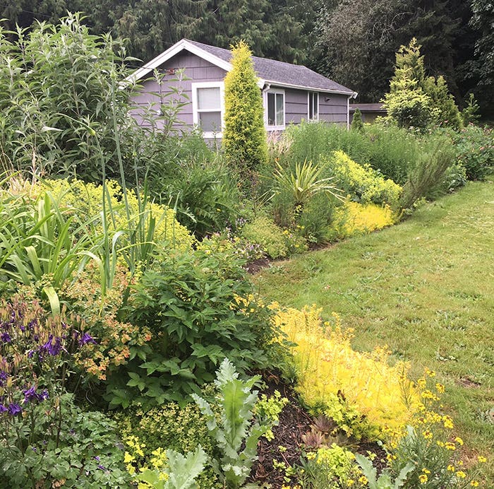
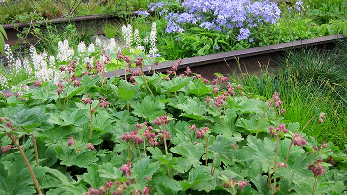
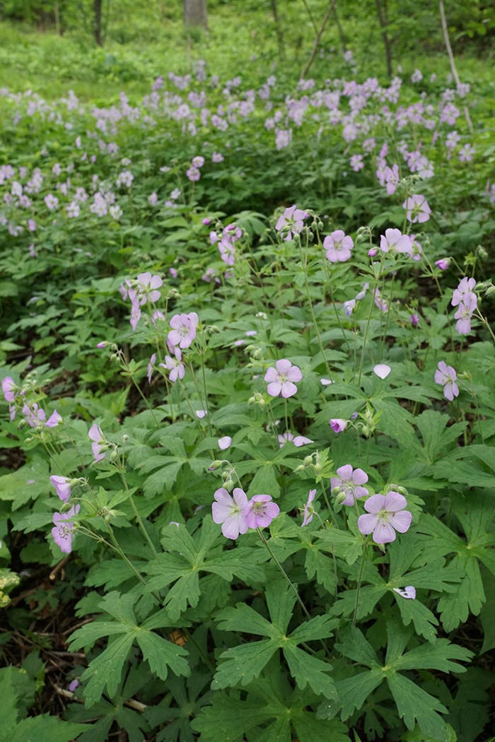
But did you know it's helpful to also consider color intensity in combinations? Instead of just considering a leaf or flower's color, look at how intense that color is. Plants with the same degree of intensity will work best together. Pair subdued colors together, and vivid colors together, whether they contrast or harmonize. Examples: a muted violet will contrast best with a dull yellow; a bold red will harmonize better with a vivid orange than a dull one.
Combine plants by color, size and needs with the Perennial Garden Wheel, a 3-D tool for less than $8.


